Enhancing Spotlight Revenue's Website for Clarity and Visual Appeal

Project Overview
The redesign of Spotlight Revenue's website was centered on enhancing clarity and effectiveness in communicating the agency's diverse services.
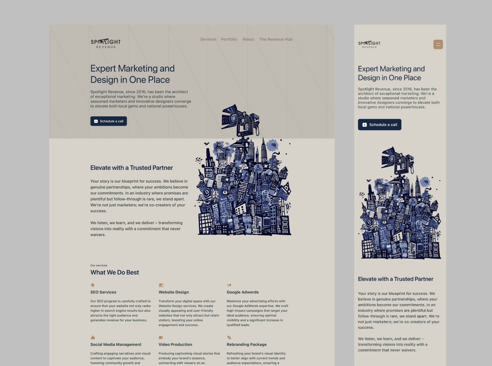
The project involved simplifying the website's structure and integrating vibrant, abstract illustrations that reflect the brand's dynamic capabilities.
Challenge
The main challenge was to redesign a complex website with multiple service offerings into a user-friendly and aesthetically appealing format.
The site needed to balance professionalism with creativity, using distinctive illustrations to break the conventional corporate mold without sacrificing clarity.

Project Goals
- Create a clean, navigable website that effectively showcases the agency’s services.
- Design a website that scales with the addition of new services without disrupting the established aesthetic.
- Ensure the website functions seamlessly on both desktop and mobile platforms.
User and Business Requirements
- A visually engaging website that avoids generic stock images and over-decoration.
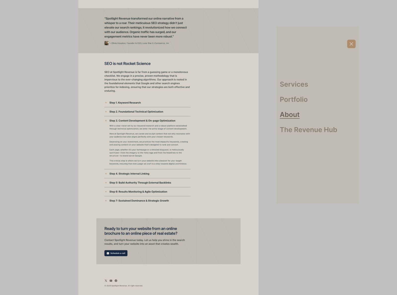
- Mobile-responsive design with an intuitive menu and easy-to-access call-to-action buttons.
- Internal components that allow for scalability and easy updates.

Process and Methodology
Research
Conducted an initial assessment of the existing website to identify areas needing improvement, particularly in how services were presented and accessed.
Wireframes and Prototypes
Developed wireframes that streamlined the navigation and service presentation, incorporating feedback from client stakeholders to refine the designs.
Visual Design
Selected a color palette of beige, gold, and navy blue to convey elegance and professionalism.
Designed custom illustrations that are colorful and abstract yet include elements representative of the brand to enhance the visual appeal.
Iteration and Feedback
Implemented a series of design iterations based on user testing, focusing on improving the usability and aesthetic of the site. Adjustments were made to optimize the mobile experience and the visibility of call-to-action prompts.

Implemented Solution
Overview
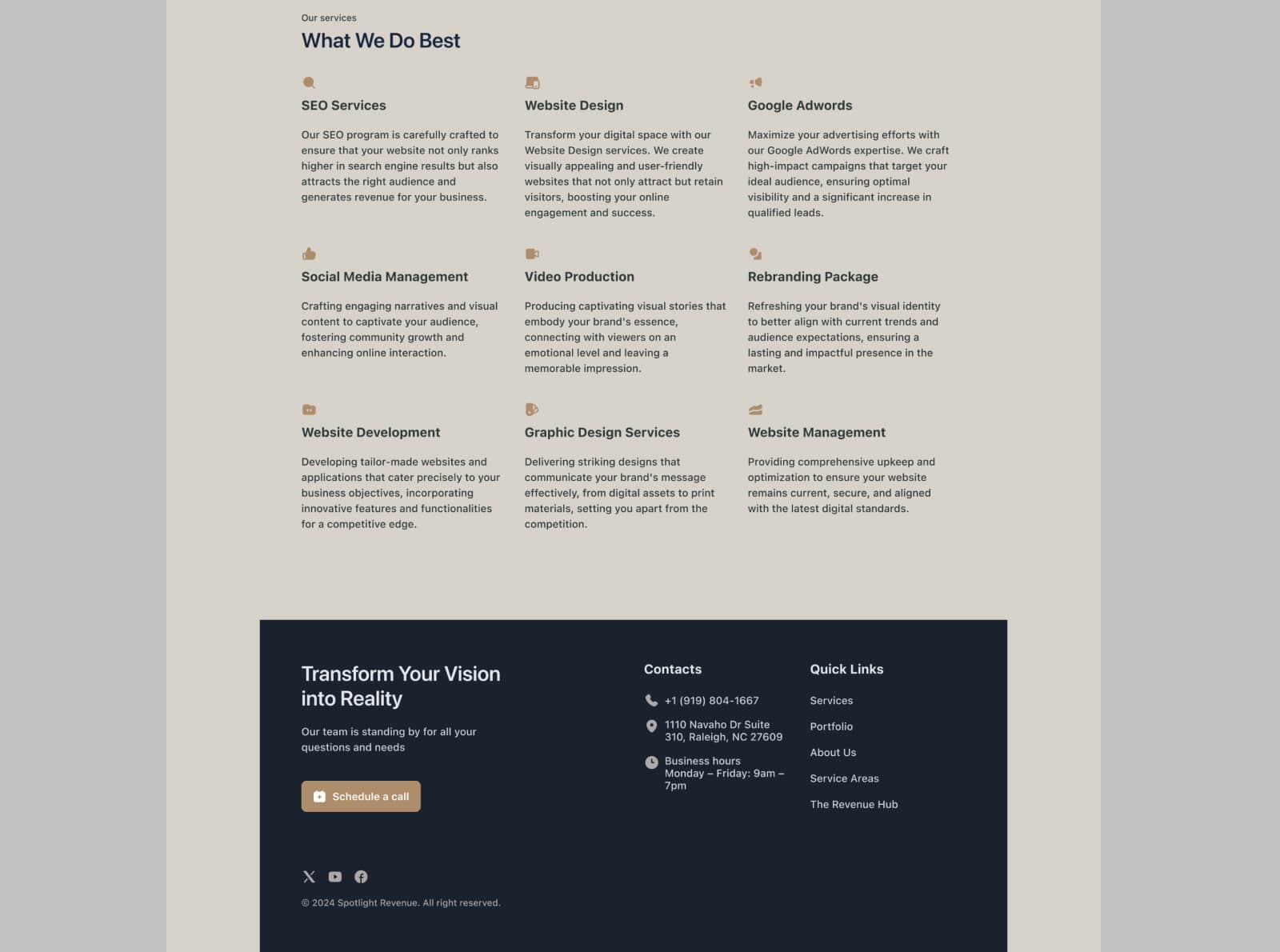
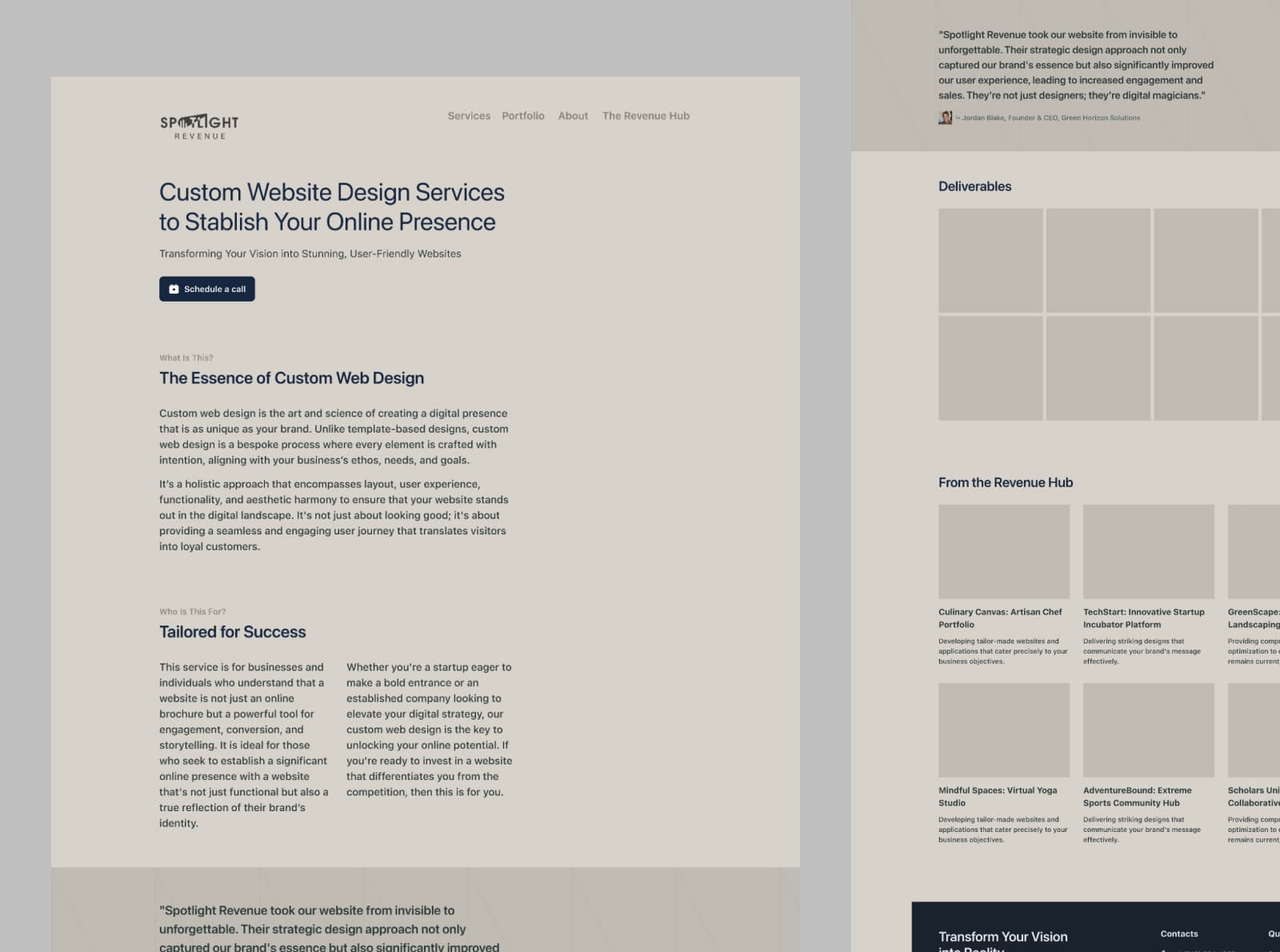
The redesigned website features a minimalist layout that is easy to navigate, with dedicated pages for each service offered by Spotlight Revenue.
The illustrations provide a colorful contrast to the site’s sober palette, adding a unique brand signature.
The website is built to be scalable, with internal components that can adapt to include new services as the agency grows.
Reflections on the Design Process
The project highlighted the importance of balancing aesthetic appeal with functional design.
The use of custom illustrations not only differentiated the site from competitors but also aligned with the brand's innovative spirit.
